Tag Archives: oii

Not Just #GE2015: Other 2015 Polling Failures

The failure of pollsters in #GE2015 was covered widely, including in a previous post here, but it was not the only opinion polling failure that year. Polls also failed to predict results by wide margins in the national elections in Israel and Poland.

The history of polling as we know it now is pretty short, dating back only to George Gallop in the US in the 1930s. Gallup successfully predicted Franklin D. Roosevelt’s win in the 1936 election, using a representative sample. The popular magazine The Literary Digest had predicted that Alfred Landon would win by a landslide. Unlike Gallup, The Literary Digest’s poll was based on an nonrepresentative sample – the magazine provided postcards for any reader to mail in with their preference.

The actual method used now by pollsters varies but most rely on some kind of automated selection of landline telephones. It is possible for polling firms to call cellphones as well but it is much more expensive, so few firms do. Of course, as people drop landlines in favor of cellphones, the pool of people responding to polls becomes less and less representative of the general population.

Israel and the Surprise Reelection of Binyamin Netanyahu

“It wasn’t a good night for Israel’s pollsters. The average of pre-election polls showed Binyamin Netanyahu’s Likud party on 21 seats, trailing the centre-left Zionist Union led by Isaac Herzog by four seats.,” Alberto Nardelli wrote in The Guardian of Israel’s March 2015 election. Instead Netanyahu was comfortably reelected. What happened?

Nardelli notes that it could be due to last-minute changes of heart in the electorate…or systematic error in the polls. In Israel polls cannot be published in the four days leading up to the election and it is possible that voters decided for Netanyahu and his Likud party in those final hours. Avi Degani a Professor at Tel Aviv University and a pollster himself blamed the poll errors on Internet-based methodologies in an interview with CNN, noting that not all voters in Israel are equally represented online.

Poland and the Unexpected Loss of Bronisław Komorowski

Just as the British Polling Council announced that it intended to carry out an investigation into the failures of opinion polls leading up to #GE2015, the Polish Association of Market and Opinion Research Organizations stated too that it planned to investigate why opinion polls failed to predict the results of the May presidential election. Contrary to predictions that the incumbent Komorowski would be comfortably reelected, the relatively unknown Andrzej Duda won instead in both the first and second rounds of voting. In an interview with the Associated Press, Miroslawa Grabowska, director of the CBOS polling agency in Warsaw, said that undecided voters would feel forced to state a preference when polled and so would point to the household name of the sitting president. Jan Kujawski, director of research with Millward Brown in Poland, pointed the blame at the fall in number of households with landlines.
Time will tell if this pattern holds true for upcoming national elections, or if more polling firms improve their results by contacting prospective voters through cellphones or other methods.

Image credit to Flickr user Mortimer62. 

GE2015: Polling Problems vs. Information Seeking Biases

By my bedtime on the night of the last UK General Election, May 7 2015, one thing, at least, was clear. No matter who won, the pollsters lost. This is what makes the possibility of the Social Election Project so exciting – the flaws of traditional polling. Leading up to the election, the polls showed the Conservative Party and the Labour Party neck in neck; yet, the Tories went on to win handily. What in the world happened with the polls? In contrast, the Social Election Prediction Project focuses on predicting elections from online information seeking behavior such as search trends, a source with its own set of biases. How do the the biases of this method compare to the issues with the polls leading up to the election?

Problems with Traditional Polling
First, it is important to note that the polls leading up to GE2015 were not just wrong on the whole; they were wrong in a consensus. All predicted a tie, or close to it, between the two majority parties when the outcome was anything but. Why were the polls are all so biased in similar ways? A few ideas…

Because the polls report percentages, not seats. Comres, for example, in their final predictions set the Conservatives at 35 percent, Labour at 34 percent and UKIP at 12 percent nationally. Of course, due to the first past the post system, voting percentages do not translate neatly to seats in the House of Commons.

…Because of how the polls ask about specific constituency preference. FiveThirtyEight noted that their model would have been far more accurate if they used a more “generic” question about party preference, as opposed to the question they used regarding preference for candidate in the respondent’s specific constituency.

…Because voters changed their minds. Peter Kellner, the President of the polling firm YouGov insinuated as much in an interview with The Telegraph.

…Because of the effect of earlier polls showing the strength of the SNP. Early polls showed the SNP gaining in strength and as the New York Times noted that later in the election the “Conservatives had adroitly exploited fears among voters that the Labour Party would be able to govern only in coalition with the Scottish National Party.”

…Because of the perennial issue of shy tories? Long a known factor in UK polling, more people will vote Conservative than will declare such to a pollster.

…Because of the way the poll participants were recruited? Poll respondents are representative by age, sex and social class, but as The Guardian notes, there still might be other divides between people who will respond to an online and telephone poll and those that will not.

…Because of the results of the other polls. Market research firm Survation noted that their final poll predicted a Conservative victory much in line with the final result but the poll seemed so out of sync with all the others that they declined to published it. This is not the first time in recent memory that UK opinion polling was notably inaccurate. In 1992, opinion polls leading up to the election predicted a Labour victory and yet the Conservatives won handily. A group of pollsters convened an inquiry following the embarrassment of the 1992 election and pinned the problem on: voters switching late in the election, unrepresentativeness in the people polled and shy tories.

Biases in Online Information Seeking
Using information from online information seeking, such as search trends, can remedy some of the above problems. One does not have to adjust for shy tories for example, or the wording of the question as search trend data constitutes demonstrated, not reported, behavior. Furthermore, search trend data would change as a voter considered new options and so could accommodate strategic voting. However, using online information seeking data presents its own issues. While the majority of the UK population uses the Internet, according to the 2013 Oxford Internet Survey, there is still 22 percent of population that does not. These people will not be represented at all in search trends.

Furthermore, of the UK voters that do use the Internet, they may not use our data sources such as Wikipedia, when they are looking for information. Yet the social election prediction project encompasses far more countries than just the UK; the next blog post will discuss how polling practices – and polling reliability – varies around the world.

Image credit to Flickr user ThePictureDrome

The (Local) General Election on Twitter

The UK’s national election is decided on a constituency basis: 650 odd separate small elections, each returning one MP. Despite the obvious importance of national parties and their leaders for shaping the election campaign as a whole, it is commonly accepted that the ability of local campaigns is also a significant factor. For example, the Liberal Democrats are well known for having highly organised local activities in their home constituencies; something which might help them hold onto seats despite their overall poor polling in national polls. Given this, for those interested in the influence of social media on the election, it’s worth looking not just at nationally relevant hashtags and Twitter accounts, but how local candidates have been using social media.

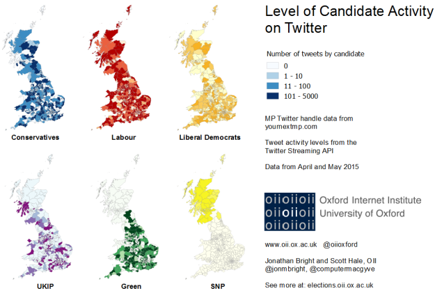
In a previous post Taha Yasseri and Stefano de Sabbata looked at the distribution of candidate accounts on Twitter, based on data from YourNextMP. In this post, using the same YNMP data as well as tweets collected by Scott Hale from the Twitter Streaming API over the last month, we look at the actual tweeting activity of MPs. The map below shows the level of activity of each MP in each British constituency for six UK parties in the month leading up to the election. The scale shows light, medium and heavy users of Twitter

OII - GE2015 - Candidate Activity on Twitter - Bright, Hale - web

Level of candidate activity on Twitter

Almost 450,000 tweets were sent by candidates of these six parties in the month leading up to the general election (the Labour party sent over 120,000, the Conservatives and the Green Party sent around 80,000 each, the Liberal Democrats just over 70,000, UKIP just over 60,000 and the SNP just over 15,000).

Compared to the map which Taha and Stefano produced on account distribution, in this new one regional patterns are clearly more apparent: whereas the major parties have candidates with Twitter accounts almost uniformly across the UK, their level of usage varies a lot. Only the SNP are uniform heavy users of Twitter: only two of their candidates sent less than 10 tweets in this period, and the majority sent more than 100. This also chimes with the fact that they are the party who has, relative to the overall number of candidates, created the most Twitter accounts – clearly they have a very active and organised social media presence.

OII - GE2015 - Tweet Histograms - Bright, Hale

Candidate activity on Twitter by party

The histogram above show more detail about the level of twitter activity and how it breaks down between different parties. Conservative, Green and Labour have broadly similar patterns, with the average candidate having sent around 100 tweets in the last month, whilst a few have sent several thousand. UKIP and the Liberal Democrats show a flatter distribution.

Of course, it’s one thing to tweet, but is anyone else actually listening? More on that soon…

Which parties are having the most impact on Twitter?

The previous two posts have shown that the amount of effort parties are putting in on Twitter at the local level is pretty variable. But what about the response they are getting? In this post we’ll look at the amount of mentions candidates receive on Twitter. A mention could be a retweet or it could be a message @ someone – any time the candidate’s name is in there. Data was harvested from Datasift, using the same YourNextMP data for the list of candidate Twitter handles.

In the week before the election candidates were mentioned over one million times. Lots of that activity, it goes without saying, goes to the party leaders: Ed Miliband accounts for almost 120,000 of those mentions alone, with, Cameron, Farage, Clegg and Bennett in places 2 – 5. Yet there was also a lot of activity for less nationally famous figures: over the 2,312 candidates in the YourNextMP dataset, only 12 weren’t mentioned even once during that week (and none of them tweeted either).

Why do some candidates get more attention than others? The most obvious explanation is that some candidates tweet more than others: and being active on social media ought to be a way of getting noticed. The image below plots all of the candidates in the dataset as a point, comparing the number of times they tweeted with the number of times they are mentioned, on a logarithmic scale. The positive relationship is clear.

TwitterMentions-scatter

Twitter mentions of local party candidates

However within all the points, there also seem to be some differences between the parties.  The figure below makes the different clearer by grouping all the candidates into a per party average. What it shows is that, while for every party writing more tweets tends to get more mentions, some parties have a much better “Tweet to mention” ratio than others. In other words, their tweets have on average more impact, and their presence is on average greater. Like the previous one, this graph is on a log scale, meaning that the differences between parties are in orders of magnitude. So, for example, 100 tweets from a Lib Dem candidate would give around 100 mentions; but the same amount from an SNP candidate would give over 1,000 mentions.

TwitterMentions-line

Twitter mentions of local party candidates – averaged by party

Broadly speaking, we can see the parties form three groups on social media in terms of outreach: the SNP are clearly in front, Labour and Conservatives are in the middle, and the Greens and Liberal Democrats at the back. UKIP are somewhere in between the middle and back groups. Interestingly, these relationships hold more or less regardless of the amount of tweets sent by the candidate (and the most famous candidates were by no means the most avid tweeters – Miliband for example only authored 20 tweets in this period, whilst others authored several hundred).

Summary? Some parties have a lot more impact on social media than others.

NB: Post was updated slightly @ 19.45 to correct a data collection issue – overall conclusions weren’t change.

What if mentions were votes?

The last post looked at mention activity for each British constituency. What would happen if we took these mentions to be votes? Does this reaction from social media offer any potential insight into what might happen in the election? In the image below (top),  using the same week of Twitter data from Datasift and YourNextMP, we identify which party “won” the Twitter mention battle in each constituency. The blank constituency on the map is Buckingham (the speaker’s constituency), and we have of course excluded Northern Ireland and Plaid Cymru entirely, which was done purely to limit the number of parties and hence make the job a bit more feasible in real time.

Of course, as we highlight in the previous post, there is a strong relationship between the amount of times a candidate tweeted and the amount of mentions they got: and we don’t want to just measure how much effort candidates have been putting in online, but the relative level of attention they generate. Hence in the map we divide the overall number of mentions of a candidate by the amount of tweets they published themselves, giving us a kind of relative measure of a candidate’s impact on Twitter.

The map below ours is a constituency level forecast based on polling data for the purposes of comparison, lifted straight from our colleagues at electionforecast.co.uk.

Twitter-election

Constituency level Twitter winners

electionforecast.co.uk

Constituency level prediction from http://www.electionforecast.co.uk/

As you can see the number of seats “won” in the Twitter vote diverges significantly from the electionforecast.co.uk model (which is, of course, much closer to what is actually going to happen), but is nevertheless not entirely unrealistic. Labour are understated to a large degree, whilst the reverse is true for UKIP and the Green Party. Labour, Liberal Democrats and SNP are somewhere within the ball park (+/- 30).

Of course, we didn’t really expect this type of method to offer a perfect “prediction” of the election: it would be a major surprise (and probably a coincidence) if it did. My guess is it indicates more something about the loyal / activist base present in a constituency than voter levels. Hence it will be interesting to see if the seats given to some of the more minor parties using this method are areas where these parties do surprisingly well or beat the national trend. For example, are the 35 Green Party constituencies we highlight places where the Greens manage to make a major improvement on their vote share?

Which parties were most read on Wikipedia?

Taha and Stefano previously looked at the distribution of Wikipedia pages by candidate. These pages are much more patchy than Twitter handles: only in the Conservative and Labour cases do more than 40% of candidates have an account, whilst most other parties have far less (though we should note that we are relying on the data crowdsourced by YourNextMP, which is brilliant but not guaranteed to be perfectly accurate). This could be a mistake: the 520 candidates who did have a Wikipedia page together garnered 1.6 million views in the week before the election. Could the candidates who didn’t make have missed a trick? Again, the party leaders account for a lot of the traffic: David Cameron and Ed Miliband contribute around 400,000 of those views alone. But many other pages attracted several thousand views, which in the context of a closely contested election in constituencies of around 70,000 in size, could be quite significant. The distributions of page views by party are shown below.

Wikipedia-Bar

How do Wikipedia views compare to activity on Twitter? They are uncannily similar: they are highly correlated, and at around the same levels: on average, candidates which got 1,000 Twitter mentions got 1,000 Wikipedia views. Perhaps a surprise – considering the very different mechanisms which generate the data.

TwitterMentions-vsWikipedia

The question is of course: do these Wikipedia views make any difference to the local battles? Once we have the full results we can find out…

Where do people mention candidates on Twitter?

In previous posts we’ve looked at people mentioning local party candidates on Twitter. In that post we basically assumed that people mentioning local candidates were based in the same constituency as the candidate themselves. But is that the case? It could be that the majority of tweets are coming from large cities, especially London, where the majority of the party machines are typically based.

Candidate Mention Locations

Candidate mention locations on Twitter in the month leading up to the UK General Election 2015

To provide a rough check of this, we looked at all mentions of candidates on Twitter during the last month which had geolocation enabled (usually because they are tweeted through a smartphone). Geolocated tweets are a fraction of the overall tweets produced (less than 5%); nevertheless, they provide a rough and ready way of checking that all of our candidate tweets are not from one place.

In short, candidate mentions are pretty evenly spread through the country (albeit based on a relatively small amount of data): there is no sense they are concentrated in one part of the country.

Social Media + Elections: A Recap

OII - GE2015 - Candidate Activity on Twitter - Bright, Hale - web

From Jonathan Bright and Scott Hale’s blog post on Twitter Use.

In the run-up to the general election we conducted a number of investigations into relative candidate and party use of social media and other online platforms. The site elections.oii.ox.ac.uk has served as our hub for elections-related data analysis. There is much to look over, but this blog post can guide you through.

Twitter

What if mentions were votes?” by Jonathan Bright and Scott Hale

Which parties are having the most impact on Twitter?” by Jonathan Bright and Scott Hale

The (Local) General Election on Twitter” by Jonathan Bright

Where do people mention candidates on Twitter?” by Jonathan Bright

Twitter + Wikipedia 

Online presence of the General Election Candidates: Labour Wins Twitter while Tories take Wikipedia” by Taha Yasseri

Wikipedia 

Which parties were most read on Wikipedia?” by Jonathan Bright

Does anyone read Wikipedia around election time?” by Taha Yasseri

Google Trends

What does it mean to win a debate anyway?: Media Coverage of the Leaders’ Debates vs. Google Search Trends” by Eve Ahearn

Social Media Overall

Could social media be used to forecast political movements?” by Jonathan Bright

Social Media are not just for elections” by Helen Margetts

Does anyone read Wikipedia around the election time?

I already have written about the Wikipedia-Shapps story. So, that is not the main topic of this post! But when that topic was still hot, some people asked me whether I think anyone ever actually reads the Wikipedia articles about politicians? Why should it be important at all what is written in those articles? This post tackles that question. How much do people refer to Wikipedia to read about politics, specially around the election time?

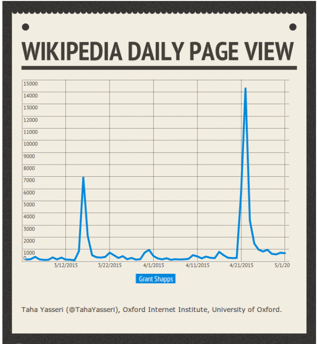
Let’s again consider the Shapps’ case. Below, you can see number of daily page views of  of the Wikipedia article about him.

Screenshot from 2015-05-04 22:57:35

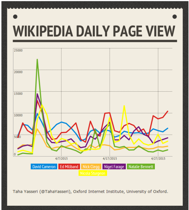
As you see, there are two HUGE peaks of around 7,000 and 14,500 views per day on top of a rather steady daily page view of sub-1000. The first peak appeared when “he admitted that he had [a] second job as ‘millionaire web marketer’ while [he was] MP“, and  the second one when the Wikipedia incident happened. Interesting to me is that while the first peak is related a much more important event, the second peak related to what I tend to call a minor event, is more than twice as large as the first one. Ok, so this might be just the case of Shapps and mostly due to media effects surrounding the controversy. How about the other politicians, say the party leaders? See the diagrams below.

Screenshot from 2015-05-04 22:57:45

A very large peak is evident in all the curves for all the party leaders with a peak of 22,000 views per day for Natalie Bennett, the leader of the Green party. Yes, that’s due to the iTV leaders’ debate on the 2nd of April. If you saw our previous post on search behaviour, you shouldn’t be surprised; surprising is the absence of a second peak around the BBC leaders’ debate on 16th of April, especially when you see the diagrams from our other post on Google search volumes.

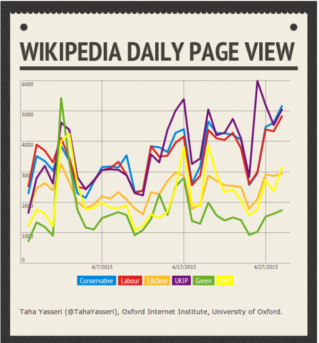
How about the parties? How many people read about them on Wikipedia? Check it out below.

Screenshot from 2015-05-04 22:57:52

Here, there seems to be a second increase in the page views after the BBC debate on 16th April. Moreover, there is an ever widening separation between the curves of Tory-Labour-UKIP and LibDem-Green-SNP curves. This is very interesting, as Tories and Labours are the most established English parties, whereas the UKIP is among the newest ones. That’s very much related to our project on understanding the patterns of online information seeking around election times.

Online presence of the General Election Candidates: Labour wins Twitter while Tories take Wikipedia

Some have called the forthcoming UK general election a Social Media Election. It might be a bit of exaggeration, but there is no doubt that both candidates and voters are very active on social media these days and take them seriously. The Wikipedia-Shapps story of last week is a good example showing how important online presence is for candidates, journalists, and of course voters. We don’t know how important this presence is in terms of shaping the votes, but at least we can look into the data and gauge the presence of the candidates and the activity of the supporters. In this post and some others we present statistics of online activity of parties, candidates, and of course voters. For an example, see the previous post on the searching behaviour of citizens around the debate times.

Who is on Twitter?

Candidates and parties are very much debated by supporters on social media, particularly Facebook and Twitter. But how active are candidates themselves on these platforms? In this post we show simply how many candidates from each party and in which constituencies have a Twitter account. Some of them might be more active than others and some might tweet very rarely, and we will analyse this activity in the next posts. Here we count only who has any kind of publicly known account.

t_all_small

Geographical distribution of candidates who have Twitter account.

The figure above shows the geographical distributions of candidates for each party and whether they have a Twitter account. There are some interesting results in there. For example, Labour has the largest number of Twitter-active candidates, whereas ALL the SNP candidates tweet. While LibDem and Green parties have the same number of accounts, normalised by the overall number of constituencies that they are standing in, Green seems to be more Twitter-enthusiastic. UKIP loses the Twitter game both in absolute number and proportion.

Who is on Wikipedia?

Having a Twitter account is something of a personal decision.  A candidate decides to have one and it’s totally up to them what to tweet. The difference in the case of Wikipedia, is that ideally candidates would not create or edit one about themselves. Also the type of information that you can learn about a candidate on their Wikipedia page is very different to what you can gain by reading their tweets.

Geographical distribution of the candidates, whom Wikipedia has an article about.

Geographical distribution of the candidates, whom Wikipedia has an article about.

The figure above shows the constituencies that the candidates standing in are featured in the largest online encyclopaedia, Wikipedia. Here, Tories are the absolute winners, in terms of the number of articles. Greens are the least “famous” candidates and LibDem are well behind the big two. In the next post we will explore often voters turn to Wikipedia to learn about the parties and candidates, and I’m sure by reading that you’ll be convinced that being featured on Wikipedia is important!

Gender?

All right, so far, Labour won Twitter presence and Tories took Wikipedia (remember all the SNP’s also have a Twitter account). But how about the gender of the candidates? Is there any gender-related feature in social presence pattern of the candidates?

First let’s have a look at the gender distribution of the candidates.

Geographical distribution of the candidates colour-coded by gender.

Geographical distribution of the candidates colour-coded by gender.

As you see in the figure above, there are fewer female candidates than male ones across all the parties. Only 12% of the UKIP candidates are female while the Greens have the highest proportion at 38%. Tories sit right next to UKIP on the list of the most male oriented parties. There is also a clear pattern that most of the constituencies in the centre have male candidates.

How about social media?

Among all the candidates, 20% of male candidates are featured in Wikipedia, whereas this is about 17% for female candidates. Almost half of the Tories male candidates are in Wikipedia, whereas this goes down to 28% for their female counterparts. Only Labour female candidates have more coverage in Wikipedia compared to the males of the party, but the difference is marginal. ّIn all the other parties, males have a higher coverage rate. The tendency of Wikipedia to pay more attention to male figures is a very well known fact. 

Twitter is different. Slightly more female candidates (76%) have a Twitter account than male candidates (69%). Almost all (96%) of Labour females tweet, and Tory female candidates are more active than their male candidates. This pattern however is lost for the UKIP candidates, as 52% of their males are on Twitter compared to only 44% of their female candidates (who have the lowest rate among all the party-gender groups).

Data

The data that we used to produced the maps and figures come mainly from a very interesting crowd-sourced project called yournextmp. However, we further validated the data using the Wikipedia and Twitter API’s. If you want to have a copy, just get in touch!